Alright,
Let's get started.
I was just going to say hearts are lovely.
Thank you if you have the menu.
Hearts follows shares and donations are how this platform keeps itself going.
So thank you for any way you can step up and support this platform and myself being here and of course any other teachers through those means.
We really appreciate it.
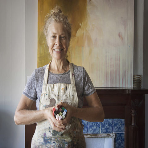
I'm Patricia Baldwin-Sagerberg and I come here to share all about creativity and expression and the value of it as a meditative process,
As a contemplative process.
So today we're at day two and if you haven't had a chance to look at my audios,
I think it was just this morning,
The first week last week,
Red.
I edited it and got it up there on Insight Timer and it went live.
Well,
It's available to be listened to as an auditory recording as of this morning.
So if you missed red,
It is there for you as a recording and today we're hitting on orange.
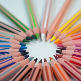
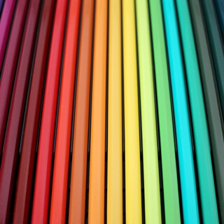
Colors of the rainbow,
ROYGBIV,
We're doing that.
So for seven Mondays in a row,
Sort of,
For looking at color theory and what colors say to you and your creative practice.
A few little technical details we'll discuss but more importantly,
What I'm here to talk about is the spiritual and energetic resonance that comes through and how you interpret that as you paint it because painting for me anyway is very intuitive.
I was going to say unconscious but that's not quite right.
Subconscious,
It's very intuitive.
So I have to pull my pieces and create spaces like this where I look at them again and see in retrospect the impact that I was going after or that,
As I said,
Spiritual resonance or energetic resonance I was trying to create.
So we get into a little bit of that.
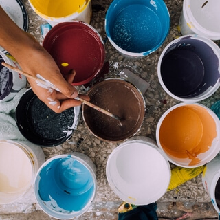
Now of course there are dozens if not hundreds of books and articles available on the subject if you want a more exhaustive or academic exploration of color theory.
Googling is a lovely tool nowadays so check those out.
We can completely concentrate on paint and canvas and create amazing art but to understand why can help deepen the practice.
Why are we choosing this surface?
Why have we chosen this brush?
What about this color?
Is my color right now?
Why am I performing this action,
This movement,
This choice today or at all?
When we can answer these kinds of questions then pure paint on canvas takes on an entirely new depth,
Meaning an integrity.
I forgot to point out all the orange around me but that can wait.
I think you get the idea.
I agree,
Jay.
Orange is the best.
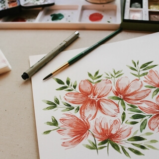
I pulled some paintings out which I will talk about and I realized I had some.
They're coral but you know coral is orange.
Iris,
Iris here.
Cut them in my yard and brought them in with my roses this morning.
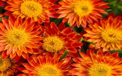
So today orange.
Orange is refreshing.
It's energetic.
It's a spark or in our case a spark to creativity.
It's juicy.
Orange tends to be a love it or hate it kind of color.
Rarely in-betweens.
Orange is one of the strongest measurable physical effects of any color,
Believe it or not,
Above red even,
According to the articles I read.
Like red though,
For it is so closely related,
Orange invigorates the appetite,
Increases energy levels and stimulates the thyroid to boost metabolism.
I should paint all my walls orange.
Orange is powerful.
Orange is an active color so we respond to it with heightened emotions,
Increased activity and sharper awareness of our surroundings.
Orange is thought of as saucy,
Vibrant and fun.
Think of Lucille Ball.
She's not a natural redhead.
Sorry if you didn't already know that.
But she chose that color to kind of personify the full expression of who and what she wanted to be as the comedic actress that she has been in the world.
That's a conscious choice.
Too much orange is overpowering and a large number of people consider orange their very least favorite color.
Orange can be strident and definitely exhausting if it's overused.
We associate it with danger and as an attention getting.
So we tend to see it more sparingly used in artistic expressions.
It can dominate a canvas which can throw off the harmony.
It is important to remember that the symbolism and associations of the color orange are not universal.
Sometimes we can think everybody feels the same way about a color and it's not the case culturally.
Cultural differences often play a role in how we relate to color.
In the United States people might associate orange with prison uniforms.
Well in other countries the color is linked to royalty and spirituality.
It's kind of a strange dichotomy when you look at the world as a whole.
How different,
How diversified can we use this color orange?
I personally resonate with orange.
I don't know if this is because I have birthed four suns with that orange hair or if it is my love for this color or if my love for this color precluded this life event,
These life events.
Regardless to use orange in my art is a natural reach for me.
Yeah,
Let's look at them now.
Get these flowers out of the way because I'm nervously keeping them there thinking I'm going to tip them over.
So my work.
Let's start with,
Well yeah,
This is different than the one I showed last week for red but a similar part of the series.
I might be drawn to this one.
It is orange but even more so I want to point out this orange.
It's kind of hidden back there but it's not to be denied.
The two of them together play at complementing the blues.
So if you look at the color wheel which is too far away,
Orange and blue are across from each other on the color wheel and when you put those into a painting it harmonizes.
It helps harmonize and it also brings attention to or helps play up the effect of one to the other.
This guy is a friend of a student's painting and I pulled it in to point out that without this orange,
It's kind of hard to imagine,
But without these orange spots it would be very almost too quiet although the black helps.
It's almost too quiet.
When you pop in the orange it makes the whole composition sing a little stronger.
More strongly?
Stronger.
First piece.
Still working on this series and figuring out where I'm going.
I've never used this much activity in painting so I keep putting them aside and going,
What are you doing?
This painting,
The orange is creating tension.
So I've balanced all the weight of the painting to this top right corner and with the orange there as well it just makes it even more impactful that this weight,
This tension exists that draws not only your eye but your energetics as well.
And then there's this calm space to offset that massive activity.
This calm space that plays against it but with it as well.
So tension.
And then last but not least,
Again,
Work in progress.
I just lost the word for this.
I'm painting with all orange here.
I was going to say analogous but it's all the same color.
My point was to basically tell the story of orange and I've got these in a series with other colors as the dominant feature color as well,
Playing with harmonies within that color,
Within that shade and you can see it's very calming.
Even though it's that bold orange still going on,
It's still a calming composition because it's not,
You don't have that complement like I said with the blue and the orange across from each other,
Playing at each other,
Creating that tension.
I haven't weighted it in any way that makes one part stronger than the other.
It's quite harmonious and calm.
So how do you use orange?
Have you ever used orange?
Maybe some of you don't have it in your paint box whatsoever.
Is it strictly to complement the blue like that turquoise against the burnt orange soil of Santa Fe?
Ask yourself now.
Let's close our eyes.
Ask yourself.
Feel it.
Sink into your body.
What's your first instinct of what orange means to you?
Where do you feel it?
Where does orange activate in your body?
And if you can feel it somewhere,
Find its location,
How do you respond to that location?
Is it disruptive or disturbing?
Uplifting or inspiring?
And if you don't appreciate orange,
Can you change your mind about it in the smallest way?
Energetically,
We relate to orange as the second chakra.
It's the color associated with happiness.
So there's a twist for you.
If orange isn't one of your go-to colors and you,
You know,
Just makes you kind of grind your teeth,
Realize it's about happiness.
Orange is about happiness.
That second chakra is responsible for,
Among other things,
Self-confidence,
Self-esteem,
And self-worth.
It also rules how attractive you think you are.
If you think you're too fat or too thin,
Too wide or too tall,
Then your body and thoughts will resonate with this negative output of energy.
I don't think that's news to any of you.
You can identify with that concept.
This negative energy can become trapped within this second chakra area where it eventually is absorbed and manifests as emotions,
Emotional and physical imbalance.
So that's that sacral chakra,
Just about,
Just below the belly button.
That's the second chakra area.
It manifests as emotional and physical imbalances.
A way to offset that,
To start pushing that and explore it for yourself in your energetic body,
In your thinking,
In your assessing,
Is to wear orange clothing and makeup,
Although that's a little frightening.
And consuming orange foods,
It literally moves the energy and helps move us.
So,
This brings us to the same place we landed at last week with Rhett.
What of all this?
My bringing this information to the forefront is not so as to have you have a better education around the color world,
But rather to have you more consciously aware of what you are trying to say or not say in your art.
In short,
To better express your unique personal self more deeply through your brush.
And hopefully,
By the end of this seven,
We're going to actually end up with eight weeks of exploration to more harmoniously,
I'm going to use that word too much today,
To more harmoniously use these colors and understand their impact on you and from you.
So how do we do this with orange?
How is your personality,
Character,
Values,
Heart,
Spirit,
Or intention expressed through the use of orange in your arts?
And finally,
What story are you telling with orange as an integral player in the compositions you create?
Let your brain chew on that while you pick up your orange.
Now,
As always,
As last time and we will continue,
I'm giving you a challenge this week.
This one's important to me.
Orange.
The sacral chakra,
That second chakra.
It's the place I've most struggled.
And to come to it conscientiously,
Consciously and conscientiously,
In this way,
Working through these vehicles that are so comfortable to us,
That we've chosen as expressive modes,
Paints,
Color,
Makes it safe to pick up that orange and gently ask yourself these questions.
Now,
If it gets too tender,
You pull back a little bit.
Keep playing.
So this week,
The challenge I offer you again,
Gently,
Is to take the information you disseminate from this exploration,
What I've spoken and what we'll do in this brief five minutes,
And put them into your creative practice,
Either in paint,
Or as I said last week in a story,
Perhaps,
Write a paragraph just about why you paint with orange or why you don't paint with orange or what it might mean to the paintings you do to invite orange to the party.
All right.
Five minutes.
I'm going to start myself by getting this large guy out of the way because I'm working behind it.
Today,
I'm excited to color in my dots,
Starting with that orange.
So as you're comfortable,
I'll hit this chime,
Hit this alarm,
And when it goes off,
I'll wave off and say goodbye.
I bring it also to your attention that we are not meeting next week,
Not this coming Sunday nor a week from today.
I have other obligations,
But we will come back two weeks from today and get into what?
Yellow.
One of my most favorite colors.
All right.
Five minutes with orange,
Everybody.
Enjoy it.
There are so many shades,
So much beauty to be had from it.
All right.
.
.
.
.
.
.
.
.
.
.