Welcome to the I Can't Sleep podcast,
Where I read random articles from across the web to bore you to sleep with my soothing voice.
I'm your host,
Benjamin Boster.
Today's episode is from a Wikipedia article titled,
Map.
A map is a symbolic depiction emphasizing relationships between elements of some space,
Such as objects,
Regions,
Or themes.
Many maps are static,
Fixed to paper or some other durable medium,
While others are dynamic or interactive.
Although most commonly used to depict geography,
Maps may represent any space,
Real or fictional,
Without regard to context or scale,
Such as in brain mapping,
DNA mapping,
Or computer network topology mapping.
The space being mapped may be two-dimensional,
Such as the surface of the earth,
Three-dimensional,
Such as the interior of the earth,
Or even more abstract spaces of any dimension,
Such as arise in modeling phenomena having many independent variables.
Although the earliest maps known are of the heavens,
Geographic maps of territory have a very long tradition and exist from ancient times.
The word map comes from the medieval Latin mappa mundi,
Wherein mappa meant napkin or cloth,
And mundi of the world.
Thus,
Map became a shortened term referring to a two-dimensional representation of the surface of the world.
Maps have been one of the most important human inventions for millennia,
Allowing humans to explain and navigate their way through the world.
The earliest surviving maps include cave paintings and etchings on tusk and stone,
Followed by extensive maps produced by ancient Babylon,
Greece,
And Rome,
China,
And India.
In their most simple form,
Maps are two-dimensional constructs.
However,
Since the age of classical Greece,
Maps have also been projected onto a three-dimensional sphere known as a globe.
The Mercator projection,
Developed by Flemish geographer Gerardus Mercator,
Was widely used as a tool for mapping the surface of the world.
Mercator was also the first to use and popularize the concept of the atlas as a collection of maps.
Cartography,
Or mapmaking,
Is the study of maps as a tool for mapping the surface of the world.
Roadmaps are perhaps the most widely used maps today and form a subset of navigation on the planet Earth.
They have been used to map the surface of the world since the early 20th century,
And have been used to map the surface of the world since the early 20th century.
The roadmaps are perhaps the most widely used maps today and form a subset of navigation on the planet Earth.
The roadmaps are perhaps the most widely used maps today and form a subset of navigation on the planet Earth.
In terms of quantity,
The largest number of drawn map sheets is probably made up by local surveys,
Carried out by municipalities,
Utilities,
Tax assessors,
Emergency service providers,
And other local agencies.
Many national surveying projects have been carried out by the military,
Such as the British Ordnance Survey,
A civilian government agency internationally renowned for its comprehensively detailed work.
In addition to location information,
Maps may also be used to portray contour lines,
Indicating constant values of elevation,
Temperature,
Rainfall,
Etc.
The orientation of a map is the relationship between the directions on the map and the corresponding compass directions in reality.
The word orient is derived from Latin oriens,
Meaning east.
In the Middle Ages,
Many maps included the T and O maps were drawn with east at the top,
Meaning that the direction up on the map corresponds to east on the compass.
The most common cartographic convention is that north is at the top of a map.
Here is a list of maps not oriented with north at the top.
Medieval European T and O maps,
Such as the Hereford Mapa Mundi,
Were centered on Jerusalem with east at the top.
Indeed,
Before the reintroduction of Ptolemy's geography to Europe around 1400,
There was no single convention in the West.
Portolan charts,
For example,
Are oriented to the shores they describe.
Maps of cities bordering a sea are often conventionally oriented with the sea at the top.
Route and channel maps have traditionally been oriented to the road or waterway they describe.
Polar maps of the Arctic or Antarctic regions are conventionally centered on the pole.
The direction north would be toward or away from the center of the map.
Typically,
Maps of the Arctic have zero degree meridian toward the bottom of the page.
Maps of the Arctic have the zero degree meridian toward the top of the page.
South-up maps invert the north-is-up convention by having south at the top.
Ancient Africans,
Including in ancient Egypt,
Use this orientation as some maps in Brazil do today.
Buckminster Fuller's Dymaction maps are based on a projection of the Earth's sphere onto an icosahedron.
The resulting triangular pieces may be arranged in any order or orientation.
Using the equator as the edge,
The world map of Gaut,
Vonderby,
And Goldberg is arranged as a pair of disks back-to-back,
Designed to represent the least error possible.
They are designed to be printed as a two-sided flat object that could be held easily for educational purposes.
Many maps are drawn to a scale expressed as a ratio,
Such as 1 to 10,
000,
Which means that one unit of measurement on the map corresponds to 10,
000 of that same unit on the ground.
The scale statement can be accurate when the region mapped is small enough for the curvature of the Earth to be accurate.
The scale statement can be accurate when the region mapped is small enough for the curvature of the Earth to be neglected,
Such as a city map.
Mapping larger regions where the curvature cannot be ignored requires projections to map from the curved surface of the Earth to the plane.
The impossibility of flattening the sphere to the plane without distortion means that the map cannot have a constant scale.
Rather,
On most projections,
The best that can be attained is an accurate scale along one or two paths on the projection.
Because scale differs everywhere,
It can only be measured meaningfully as point scale per location.
Most maps strive to keep point scale variation within narrow bounds.
Although the scale statement is nominal,
It is usually accurate enough for most purposes,
Unless the map covers a large fraction of the Earth.
At the scope of a world map,
Scale as a single number is practically meaningless throughout most of the map.
Instead,
It usually refers to the scale along the equator.
Some maps,
Called cartograms,
Have the scale deliberately distorted to reflect information other than land area or distance.
For example,
A map of Europe has been distorted to show population distribution,
While the rough shape of the continent is still discernible.
Another example of distorted scale is a map of the United States.
Another example of distorted scale is the famous London Underground map.
The basic geographical structure is respected,
But the tube lines and the river Thames are smoothed to clarify the relationships between stations.
Near the center of the map,
Stations are spaced out more than near the edges of the map.
Further inaccuracies may be deliberate.
Further inaccuracies may be deliberate.
For example,
Cartographers may simply omit military installations or remove features solely to enhance the clarity of the map.
For example,
A road map may not show railroads,
Smaller waterways,
Or other prominent non-road objects.
And even if it does,
It may not show them less clearly,
E.
G.
Dashed or dotted lines or outlines,
Than the main roads.
Known as decluttering,
The practice makes the subject matter that the user is interested in easier to read,
Usually without sacrificing overall accuracy.
Software-based maps often allow the user to toggle decluttering between on,
Off,
And auto as needed.
In auto,
The degree of decluttering is adjusted as the user changes the scale being displayed.
Geographic maps use a projection to translate the three-dimensional real surface of the geoid to a two-dimensional picture.
Projection always distorts the surface.
There are many ways to apportion the distortion,
And so there are many map projections.
Which map projection to use depends on the purpose of the map.
The various features known on a map are represented by conventional signs or symbols.
For example,
Colors can be used to indicate a classification of roads.
These signs are usually explained in the margin of the map,
Or on a separately published characteristic sheet.
Some cartographers prefer to make the map cover practically the entire screen or sheet of paper,
Leaving no room outside the map for information about the map as a whole.
These cartographers typically place such information in an otherwise blank region inside the map.
Cartouche,
Map legend,
Title,
Compass rows,
Bar scale,
Etc.
In particular,
Some maps contain smaller sub-maps and otherwise blank regions,
Often one at a much smaller scale,
Showing the whole globe and where the whole map fits on that globe,
And a few showing regions of interest at a larger scale to show details that would not otherwise fit.
Occasionally,
Sub-maps use the same scale as the large map.
A few maps of the contiguous United States include a sub-map to the same scale for each of the two regions.
The design and production of maps is a craft that has developed over thousands of years,
From clay tablets to geographic information systems.
As a form of design,
Particularly closely related to graphic design,
Mapmaking incorporates scientific knowledge about how maps are used.
Integrated with principles of artistic expression,
To create an aesthetically attractive product,
Carries an aura of authority,
And functionally serves a particular purpose for an intended audience.
Designing a map involves bringing together a number of elements and making a large number of decisions.
The elements of design fall into several broad topics,
Each of which has its own theory,
Its own research agenda,
And its own best practices.
That said,
There are synergistic effects between these elements,
Meaning that the overall design process of a map is very much the same.
That said,
There are synergistic effects between these elements,
Meaning that the overall design process is not just working on each element one at a time,
But an iterative feedback process of adjusting each to achieve the desired gestalt.
Map projections.
The foundation of the map is the plane on which it rests,
Whether paper or screen,
But projections are required to flatten the surface of the earth.
All projections distort the surface,
But the cartographer can be strategic about how and where distortion occurs.
Generalization.
All maps must be drawn at a smaller scale than reality,
Requiring that the information included on a map be a very small sample of the wealth of information about a place.
Generalization is the process of adjusting the level of detail in geographic information to be appropriate for the scale and purpose of a map,
Through procedures such as selection,
Simplification,
And classification.
Symbology.
Any map visually represents the location and properties of geographic phenomena using map symbols,
Graphical depictions composed of several visual variables,
Such as size,
Shape,
Color,
And pattern.
Composition.
As all of the symbols are brought together,
Their interactions are As all of the symbols are brought together,
Their interactions have major effects on map reading,
Such as grouping and visual hierarchy.
Typography or labeling.
Text serves as a number of purposes on the map,
Especially aiding the recognition of features,
But labels must be designed and positioned well to be effective.
Layout.
The map image must be placed on the page,
Whether paper,
Web,
Or other media,
Along with related elements,
Such as the title,
Legend,
Additional maps,
Text,
Images,
And so on.
Each of these elements have their own design considerations,
As does their integration,
Which largely follows the principles of graphic design.
Map-type-specific design.
Different kinds of maps,
Especially thematic maps,
Have their own design needs and best practices.
Maps of the world or large areas are often either political or physical.
The most important purpose of the political map is to show territorial borders.
The purpose of the physical map is to show features of geography,
Such as mountains,
Soil type,
Or land use,
Including infrastructures,
Such as roads,
Railroads,
And buildings.
Topographic maps show elevations and relief with contour lines or shading.
Geological maps show not only the physical surface,
But characteristics of the underlying rock,
Fault lines,
And subsurface structures.
From the last quarter of the 20th century,
The indispensable tool of the cartographer has been the computer.
Much of cartography,
Especially at the data gathering survey level,
Has been subsumed by geographic information systems,
GIS.
The functionality of maps has been greatly advanced by technology,
Simplifying the superimposition of spatially located variables onto existing geographical maps.
Having local information,
Such as rainfall level,
Distribution of wildlife,
Or demographic data integrated within the map,
Has allowed the use of maps as a means of understanding the environment.
In the pre-electronic age,
Such superimposition of data led Dr.
John Snow to identify the location of an outbreak of cholera.
Today it is used by agencies of humankind as diverse as wildlife conservationists and militaries around the world.
Even when GIS is not involved,
Most cartographers now use a variety of computer graphics programs to generate new maps.
Interactive computerized maps are commercially available,
Allowing users to zoom in or zoom out respectively,
Meaning to increase or decrease the scale,
Sometimes by replacing one map with another of different scale,
Centered where possible on the same point.
NCAR Global Navigation Satellite Systems are computerized maps with route planning and advice facilities that monitor the user's position with the help of satellites.
From the computer scientist's point of view,
Zooming in entails one or a combination of 1.
Replacing the map by a more detailed one 2.
Enlarging the same map without enlarging the pixels,
Hence showing more detail by removing less information compared to the less detailed version 3.
Enlarging the same map with the pixels enlarged,
Replaced by rectangles of pixels.
No additional detail is shown,
But depending on the quality of one's vision,
Possibly more detail can be seen.
If a computer display does not show adjacent pixels really separate,
But overlapping instead,
Then replacing a pixel by a rectangle of pixels does show more detail.
A variation of this method is interpolation.
The maps that reflect the territorial distribution of climatic conditions based on the results of long-term observations are called climatic maps.
These maps can be compiled both for individual climatic features,
Temperature,
Precipitation,
Humidity,
And for combinations of them at the earth's surface and in the upper layers of the atmosphere.
Climatic maps show climatic features across a large region and permit values of climatic features to be compared in different parts of the region.
When generating the map,
Spatial interpolation can be used to synthesize values where there are no measurements,
Under the assumption that conditions change smoothly.
Climatic maps generally apply to individual months and the year as a whole,
Sometimes to the four seasons,
To the growing period,
And so forth.
On maps compiled from the observations of ground meteorological stations,
Atmospheric pressure is converted to sea level.
Air temperature maps are compiled both from the actual values observed on the surface of the earth and from values converted to sea level.
The pressure field is the area of the earth's surface,
The pressure field in the free atmosphere is represented either by maps of the distribution of pressure at different standard altitudes,
For example,
At every kilometer above sea level,
Or by maps of barrack topography on which altitudes,
More precisely,
Geopotentials,
Of the main isobarrack surfaces,
For example,
900,
800,
And 700 millibars,
900,
800,
And 700 millibars,
Counted off from sea level,
Are plotted.
The temperature,
Humidity,
And wind on aero-climatic maps may apply either to standard altitudes or to the main isobarrack surfaces.
Isolines are drawn on maps of such climatic features as the long-term mean values to connect points with equal values of the feature in question,
For example,
Isobars for pressure,
Isotherms for temperature,
And isohydes for precipitation.
Isoamplitudes are drawn on maps of amplitudes.
Isoanimals are drawn on maps of anomalies.
Isolines of frequency are drawn on maps showing the frequency of a particular phenomenon.
Isochrones are drawn on maps showing the dates of onset of a given phenomenon,
Or the date of a particular value of a meteorological element in the course of a year.
Isolines of the mean numerical value of wind velocity,
Or isotaches,
Are drawn on wind maps,
Charts.
The wind resultants and directions of prevailing winds are indicated by arrows of different lengths or arrows with different plumes.
Lines of flow are often drawn.
Maps of the zonal and meridional components of wind are frequently compiled for the free atmosphere.
Atmospheric pressure and wind are usually combined on climatic maps.
Wind roses,
Curves showing the distribution of other meteorological events,
Diagrams of the annual course of elements at individual stations,
And the like are also plotted on climatic maps.
Maps of climatic regionalization,
That is,
Division of the earth's surface into climatic zones and regions according to some classification of climates,
Are a special kind of climatic map.
Climatic maps are often incorporated into climatic atlases of varying geographic ranges,
Or included in comprehensive atlases.
Besides general climatic maps,
Applied climatic maps and atlases have great practical value.
Aero-climatic maps,
Aero-climatic atlases,
And agro-climatic maps are the most numerous.
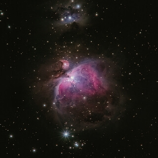
Maps exist of the solar system and other cosmological features such as star maps.
In addition,
Maps of other bodies such as the moon and other planets are technically not geographical maps.
Floor maps are also spatial but not necessarily geospatial.
Floor maps are also spatial but not necessarily geospatial.
Diagrams such as schematic diagrams and Gantt charts and tree maps display logical relationships between items rather than geographical relationships.
Topological in nature,
Only the connectivity is significant.
The London Underground map and similar subway maps around the world are a common example of these maps.
General purpose maps provide many types of information on one map.
Most atlas maps,
Wall maps,
And road maps fall into this category.
The following are some features that might be shown on general purpose maps.
Bodies of water,
Roads,
Railway lines,
Parks,
Elevations,
Towns and cities,
Political boundaries,
Latitude and longitude,
National and provincial parks.
These maps give a broad understanding of the location and features of an area.
The reader may gain an understanding of the type of landscape,
The location of urban places,
And the location of major transportation routes all at once.
Polish General Stanislaw Maciek had once been shown an impressive outdoor map of land and water in the Netherlands,
Demonstrating the working of the waterways.
This had inspired Maciek and his companions to create the Great Polish Map of Scotland as a 70-ton permanent three-dimensional reminder of Scotland's hospitality to his compatriots.
In 1974,
The coastline and relief of Scotland were laid out by Kazimierz Trafos,
A Polish student geographer-planner,
Based on existing Bartholomew half-inch map sheets.
Engineering infrastructure was put in place to surround it with a sea of water,
And at the General's request,
Some of the main rivers were even arranged to flow from headwaters pumped into the mountains.
The map was finished in 1979,
But had to be restored between 2013 and 2017.
The Challenger relief map of British Columbia is a hand-built topographic map of the province,
80 feet by 76 feet.
Built by George Challenger and his family from 1947 to 1954,
It features all of B.
C.
's mountains,
Lakes,
Rivers,
And valleys in exact-scaled topographical detail.
Residing in the British Columbia Pavilion at the Pacific National Exhibition,
P&E,
In Vancouver from 1954 to 1997,
It was viewed by millions of visitors.
The Guinness Book of Records cites the Challenger map as the largest of its kind in the world.
The map in its entirety occupies 6,
080 square feet,
It was disassembled in 1997.
There is a project to restore it in a new location.